There are lots of BI and visualisations tools, each with different features and peculiarities. However, Microsoft Excel is still the most widespread tool available to users with different skills and at different corporate hierarchy levels. This is why I like Excel’s Power Query which can turn any Excel file almost on any computer into a powerful tool that allows to analyze and visualize data pretty much like with Power BI (in fact, the ETL process is almost the same!).
In this article we are going to cover several basic steps to turn your Google Search Console (GSC) data into a SEO dashboard using Power Query.
Step 1: Export Data from GSC
When you are running search optimisation projects, you want to track the progress over time and have the ability to analyze performance of different keywords, topics and pages. Google offers GSC API for better automation of such processes, but in this article we will use the very basic and easy-to-use option to extract the data – .XLSX exports.
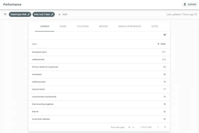
First thing you want to do is to get all those exports. Let’s say, we will track the search query progress weekly. In order to do so, in GSC we need to open the “Performance” report, set up appropriate dates for week 1 of the desired period and click the “Export” button in the upper right corner. Then, repeat those steps several times changing only the dates.
When you are finished with exporting, you will have a set of files with the same name in your download folder:
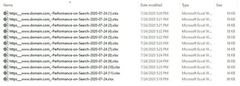
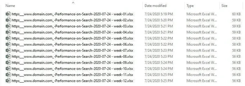
We’re going to slightly fix that by changing the ending of the file name in a way that we know which week’s data is inside each file. Be sure to have a consistent naming pattern. In the example below I used [space]-[dash]-[space]-”week”-[dash]-[2-digit week number] pattern. This will also help us when we import this data in Excel.
Step 2: Import GSC Data to Excel
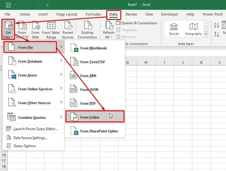
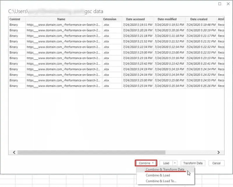
Next thing you want to do is open Excel, create a new file, go to the “Data” tab, click “Get Data” > “From File” > “From Folder” and choose the folder containing those .XLSX exports (if you haven’t done that before, now it’s the right time to move your downloaded files to a separate folder).
In the dialogue window you will see the list of your files. Click the drop-down arrow on the “Combine” button and choose “Combine and Transform Data”.
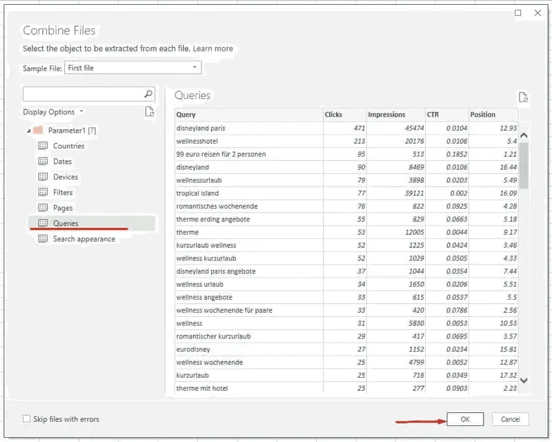
In the next dialogue window you will see the list of tabs available inside your XLSX files. Click on the “Queries” tab and then click “OK”.
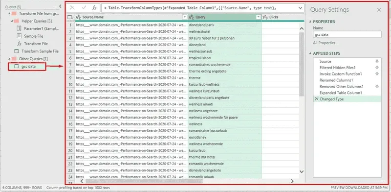
After that you will find yourself in the Query Editor window. What I like about Power Query is that it has lots of predefined processes, so there’s no need to learn things the hard way. Just let Power Query do everything automatically. So, in our example, it created several additional queries in order to combine all your files to a single dataset. We will not need them for now. As a result of these automated steps all you need is inside the query that you can find in the “Other Queries” folder in the left tab. In my case it’s called “gsc data”. Click on it to see its contents in the main part of the Query Editor window.
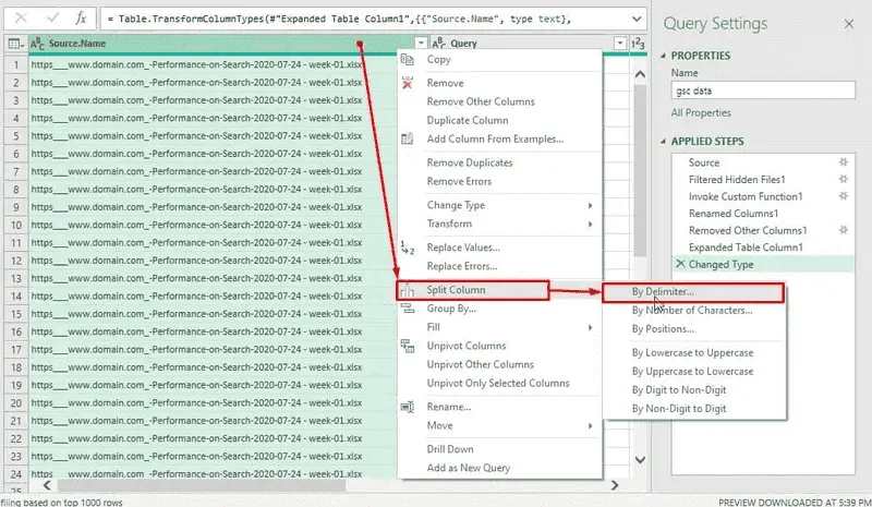
Next thing we’re going to do is to get rid of those unnecessary file names leaving only week number as a reference for our report. To do so, we’ll first split the column by delimiter.
Remember I mentioned previously the importance of consistent file naming patterns? Now it’s the right time to use that consistency. I am choosing my “ – week-“ (space-dash-space-week-dash) string as a custom delimiter to split the Source.Name column.
What you will have as a result is two columns: one with a long file name and the other one with strings like “01.xlsx”, “02.xlsx” and so on. To get rid of that we can either split that column again using “.” (dot) as a delimiter, or we can replace “.xlsx” value. It’s up to you.
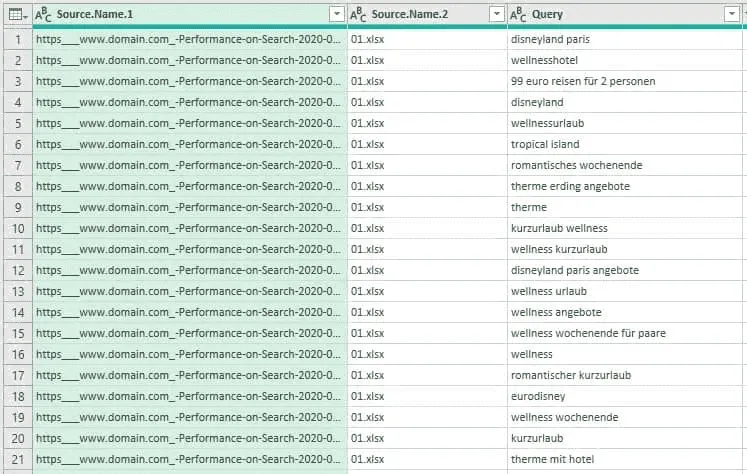
Either way, don’t forget to change the type of that column so that week numbers are defined as real numbers and not as text strings. At the end of this step you should have something like this on your screen:
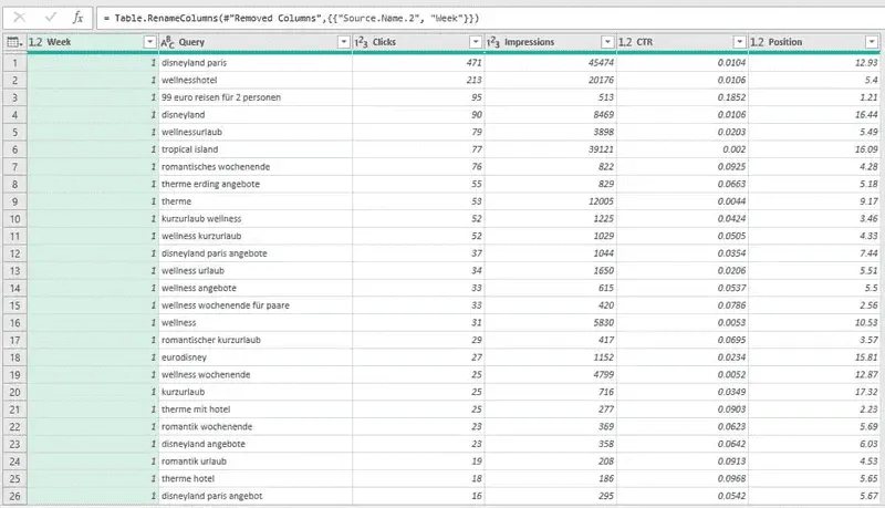
Basically, these manipulations would be enough to get the data needed for a simple dashboard. One would just need to click “Close and Load To..” button and choose “Only create a connection” and “Add this data to the Data Model”.
However, let’s add some functionality to our file.
Step 3: Add Keyword Grouping
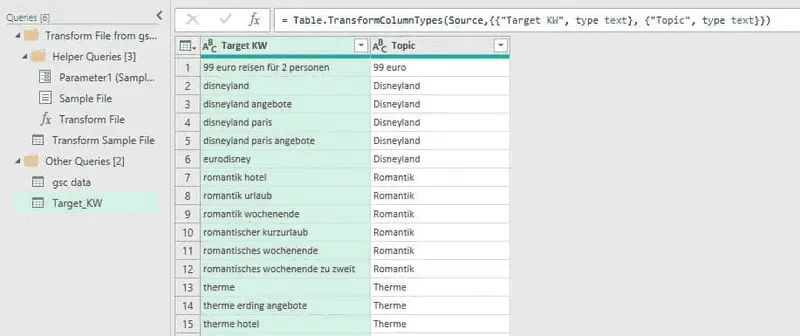
We have a list of target keywords grouped by topic as a result of keyword research we did for SEO. We may want to have this list as an additional filter or a slicer for our reports. I already turned it into a Table object (select the range you have and press CTRL+T).
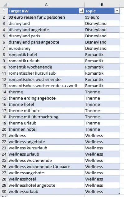
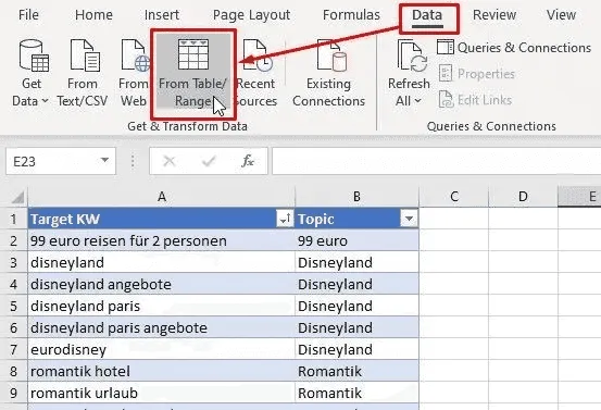
To add this data to our report we need to create another query. Click on any cell within your table, go to “Data” tab and click “From Table/Range”.
That’s it. No additional changes in this query needed.
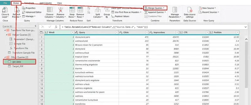
Then, click on the first query you made (in my case it’s “gsc data”), go to the “Home” tab and click the “Merge Queries” button. This is how we are going to match the data from both of our queries and have a slicer or filter.
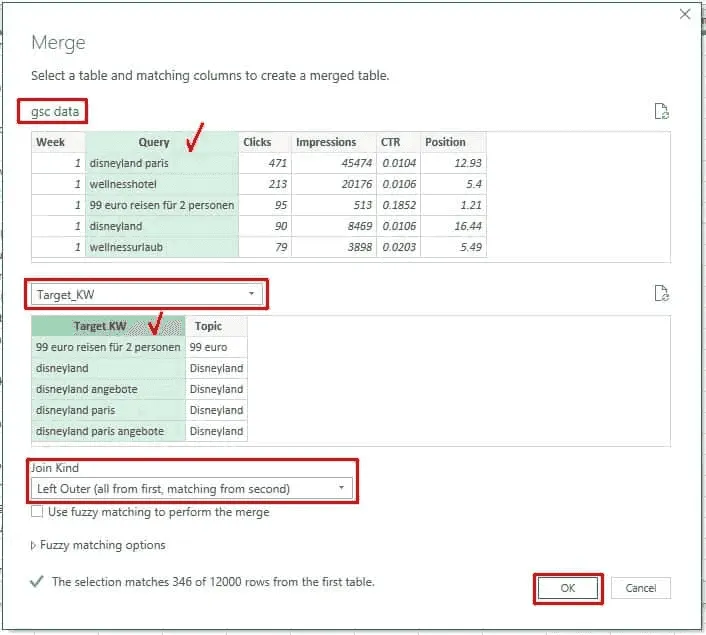
In the “Merge” dialogue window there are three main parts:
- The upper part which shows the first query we are going to merge (and its contents),
- The lower part which allows to choose a second query from a drop-down list,
- The “Join Kind” drop-down list allowing to use different kinds of merging logic.
First thing you want to do is choose the second query with our target keywords. Next you need to tell Power Query which columns need to be used in order to match both queries. To do so, click once on the “Query” column in the upper query and then click on the “Target KW” (in my case) column in the lower query. Keep the “Left Outer” join kind selected and press “OK”:
What this process will do is that it will go through the first query row by row and compare values in the “Query” column with the values of the “Target KW” column of the second query and return the contents of the second query if the values match. What we see after clicking “OK” is a new column with the name of the second query we merged it with. To see the results of matching we need to expand this column by clicking the button with two arrows in the upper right corner of the column header.
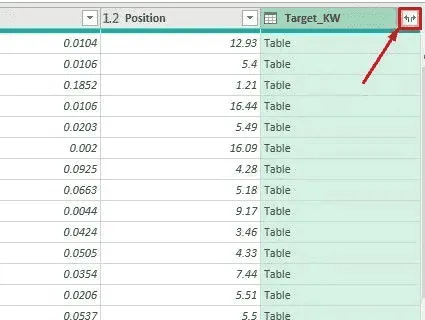
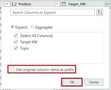
We’ll see a pop-up window showing which columns we want to see from the second query. Let’s keep both of them and uncheck the “Use original column name” option.
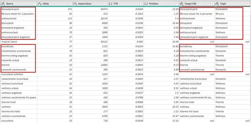
What you should see now is two new columns containing our target keywords and the corresponding topics in each row where the keywords from two queries matched.
Schritt 4: Keyword-Ranking-Gruppen hinzufügen
Zur besseren Visualisierung können wir auch eine zusätzliche Gruppierung der Schlüsselwörter nach dem durchschnittlichen Ranking vornehmen. Lassen Sie uns die folgenden Gruppen erstellen: “Top-3”, “4-10”, “11-20”, “21-100”.
Dazu können wir eine bedingte Spalte hinzufügen. Gehen Sie im Menü auf die Registerkarte “Spalte hinzufügen” und klicken Sie auf “Bedingte Spalte”. Fügen Sie dann mehrere Klauseln hinzu, wie im Screenshot unten:
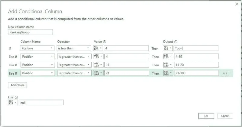
After we click “OK”, we’ll see that some of the ranking groups were misinterpreted by Power Query as dates. If you try to make a step back and put those group names in quotes, that will not look good.
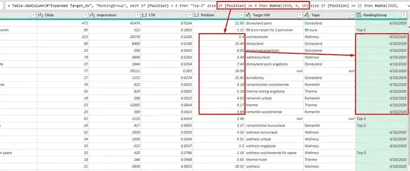
So, what we’ll do to fix that is that we’ll make the changes directly in the formula field on top of our table. Just replace #date(yyyy,mm,dd) string with “4-10” and “11-20” values and hit ENTER.
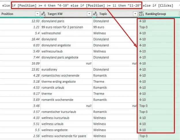
That’s it. Now we can load this query to the Data Model because we won’t need it in any other form. Also, this usually helps to significantly reduce the file size.
Step 5: Build a Dashboard
Next step will be to actually create the dashboard from several pivot tables and pivot charts. As we added the queries to the data model, just create a new sheet or use one of the existing empty sheets, go to the “Insert” tab, choose “Pivot Table” and select the “Use this workbook’s Data Model” option in the pop-up window.
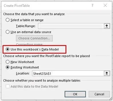
We are not going to cover the following steps in detail because now it’s a matter of custom requirements and personal preferences.
In the example below I used one pivot table that you see in the middle and two upper charts that use this pivot as the data source. Three additional pivot tables are placed on a separate sheet as the source for the charts at the bottom of the dashboard.
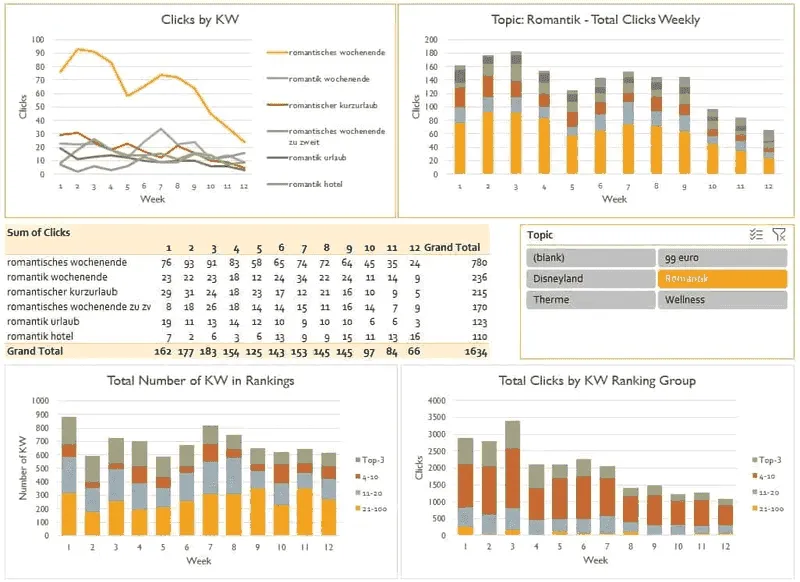
Upper left chart shows weekly clicks by keyword. Upper right chart shows pretty much the same, but as we chose the “Stacked Column” chart type, this allows us to see total clicks by the chosen topic.
Remember we added the “Target KW” query? We did it to have the slicer that you see in the middle right area of the dashboard.
And two bottom charts are showing the total number of clicks and keywords from our GSC account, grouped by rankings.
Do you want the cherry on top? The best thing about Power Query using folder as the datasource is that you can now just add new weekly GSC exports to the folder you already have and simply refresh the data connection!
So, a quick recap of how we created a SEO dashboard in Excel:
- we exported weekly Google Search Console stats in .XLSX format;
- we used “Import from Folder” option of Power Query to import several files with identical structure;
- we added another query with keywords grouped by topic and merged it with the first query;
- we also used a conditional column to add ranking groups;
- finally, we created a dashboard out of pivot tables, charts and a slicer.
Thanks for reading!

