

UPGRADE YOUR LINE CHART BY PERIOD COMPARISON & QUICK CALCULATION
You want to answer business questions via Adobe Analytics more efficiently?
We will show you how to fulfill below 3 common marketing or sales report needs via one “Right Click”.
- Get the data of different time periods (Prior period & YoY period)
- Build viz to show YoY changes
- Add the average value as a reference line in your line chart
There are tons of amazing articles on the internet about unleashing the data analysis or visualization features of Adobe Analytics. But I am not going to create another fancy “Wow” article but one “Aha” post for the marketers, especially who are Adobe Analytics beginners.
#1: Get the data of different time periods (Prior period & YoY period)
When you look at the numbers for this month, you may like to know the records of the last period or the YoY period, to get an idea of whether the performance is improving or not. Here I am showing how to add the values in the same table as different columns with just a few clicks.
#2: Build viz to show YoY changes (Line Chart & Summary Numbers)
Now we know how to quickly get the YoY values. But how about the percent changes?YoY comparison is a very common analysis. You can achieve it via using the calculated metric builder. But we want it fast! And I know that building a formula usually gives people a headache. Learn how to add the YoY data (in a line chart) and also get the calculated percent changes compared to the YoY period in Adobe Analytics.
Hint:
- Press “Ctrl” to select multiple items, then right-click to visualize them at the same time
- Lock the selection to make sure that the visualization sticks to the total numbers. Otherwise, it will show the newly selected data reflectively, when you try to build another diagram of different data in the same free-form table.
- Right-click on the legend and then select “Edit label” to customize labels
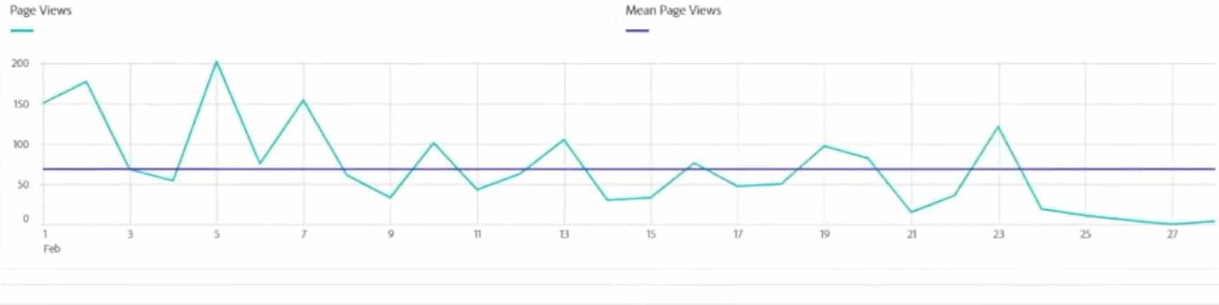
#3: Add the average value as a reference line in your line chart
Every day we see the numbers going up and down. Average (Mean) is a typical index as a reference.
Let’s add the average daily page views as a benchmark in the line chart. An example as below.
Hint:
- The other default quick calculations include Median, Max, Min, Sum. You can choose another calculation, which meets your case at most.
- Disable the anomaly detection in the line chart to prevent Adobe Analytics from marking the reference (average) line.
- If you have a constant target value, you should use the calculated metric builder.
Conclusion
Hope you enjoyed the post about unleashing the power of “Right-Click” in Adobe Analytics and feel more confident & comfortable using Adobe Analytics.
Feel free to share the tips with your team, company, and friends!
If you look for a partner to support you in Adobe Analytics-related topics, we, as an Adobe Partner, are glad to have a talk!
Click the below button to see our service scope for Web Analytics!
.b5318ca8.png)